BTTF-like sticker @ Inkscape
We’re going to organize a Java conference later this year. And it need its stickers. So let’s draw one!
As the conference’s name is “JFuture” it’s obvious thought to make something like “Back to the Future” movie logo. Moreover, we’re actually trying to combine Java’s past, current and future at the conference, so the idea is really deep.
Let’s make it: “COME TO THE JFUTURE”!
First thing to do is to find a font. Back to the Future 2002 seems to be what we need. Download and install it so it’s available across your system.
Now let’s find a logo for the reference. Wiki has one from the original movie.
Open an Inkscape and paste the image into the workspace:
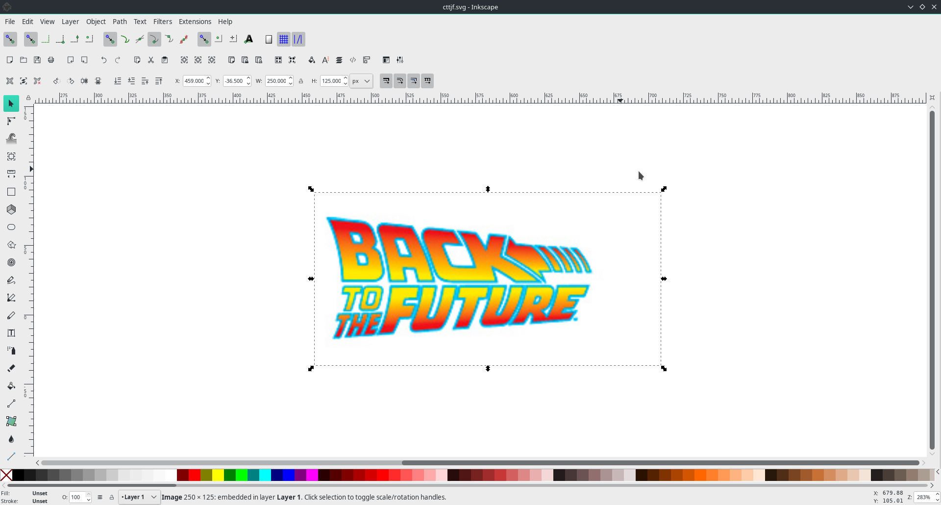
Nevermind those ugly raster picture artifacts: the result will be 100% webscale, I promise.
Select a “Bezier curves” tool (B) and draw two circumscribed polygons, one per text line.
Just click four times to make the corners sharp (if you click and drag you’ll get actually a Bezier curve, as the tool’s name).
We’ll use them as perspective bounds for transformations later:
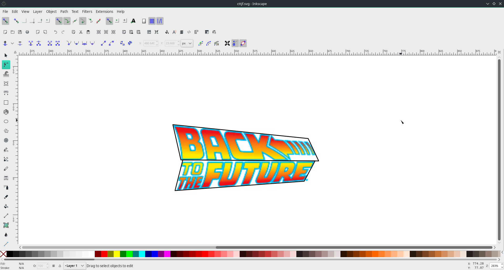
Split the upper one into two parts: one for “Back” and another one for the left arrow.
You can do that by drawing a another line with “Bezier curves” and using a “Path” → “Division” tool (Ctrl+/) when a polygon and a line are selected:
Ok, let’s move on and type the text that we want to turn into awesome sticker.
Select “Text” tool (F8) and type somewhere near the original logo:
COME<
&jfuture
Note the letter case and < and &.
If you’re using the font I’ve mentioned — Back to the Future 2002 — then letter case is important: UPPERCASED letter are skewed left and lowercased letters are skewed right.
< becomes a left arrow and & becomes a to the:
Now let’s use those three polygons as a guides for perspective distortions. The plan is to fit “come” into the upper left polygon, left arrow into upper right and “to the jfuture” into the lower polygon.
But before you can do that, you’ll need to turn your text into path by selecting the text and clicking “Path” → “Object to Path” (Ctrl+Shif+C).
Nothing changes visually when you do that, but the text is “rendered” into a path.
One important effect of that action is that now you can transfer your SVG to anyone and they will be able to open it and see the text just like you see it even without needed fonts installed.
|
Tip
|
Always turn texts into path when sharing a vector file. Do not assume recipient has all the fonts. |
Well, actually you’ll get a group of path after applying “Object to Path” tool.
Select it and do “Object” → “Ungroup” (Ctrl+Shift+G).
Select “come” by clicking its letter while holding Shift.
Group them (Ctrl+Shift+G).
Select first polygon and choose “Extensions” → “Modify Path” → “Perspective”.
|
Tip
|
Do not forget to group letters before applying “Perspective” extension. |
|
Tip
|
The order of selection is important: “Perspective” extension fits first selected path into second. |
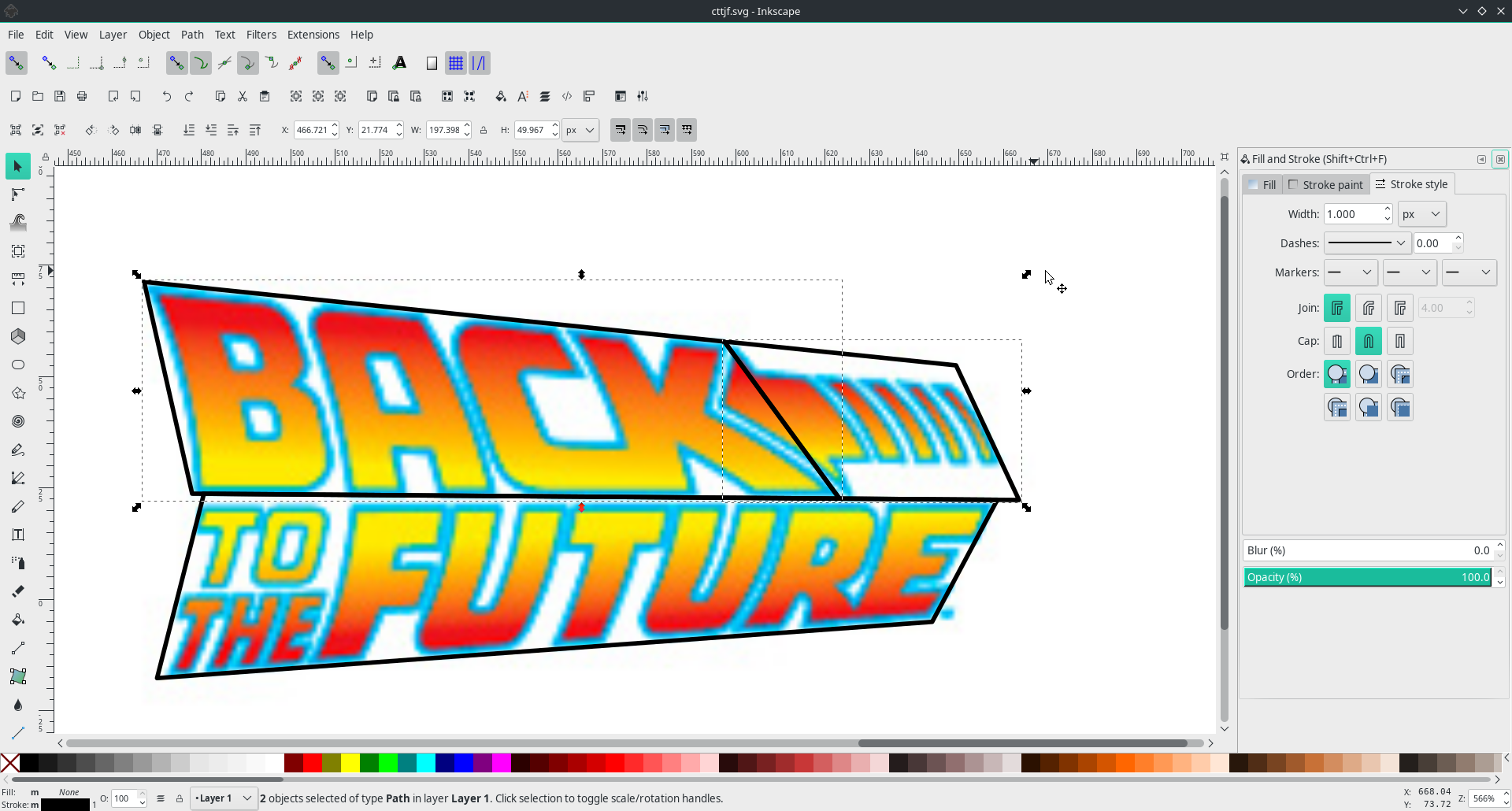
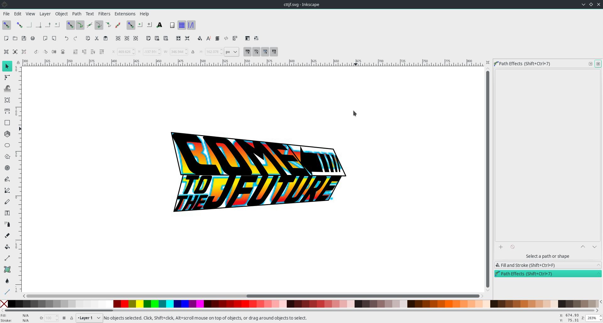
Repeat with arrow and second line of text. You need to achieve something like this:
If for some reason the letters are rotated unpredictably redraw the polygons starting from the bottom left corner. This is easy with node snapping enabled: Bezier tool will “stick” to the existing corners.
|
Tip
|
“Perspective” extension maps bottom left of your selection to the first node you draw, and continues clockwise for the other nodes. |
Remove the polygons: they’ve done their job.
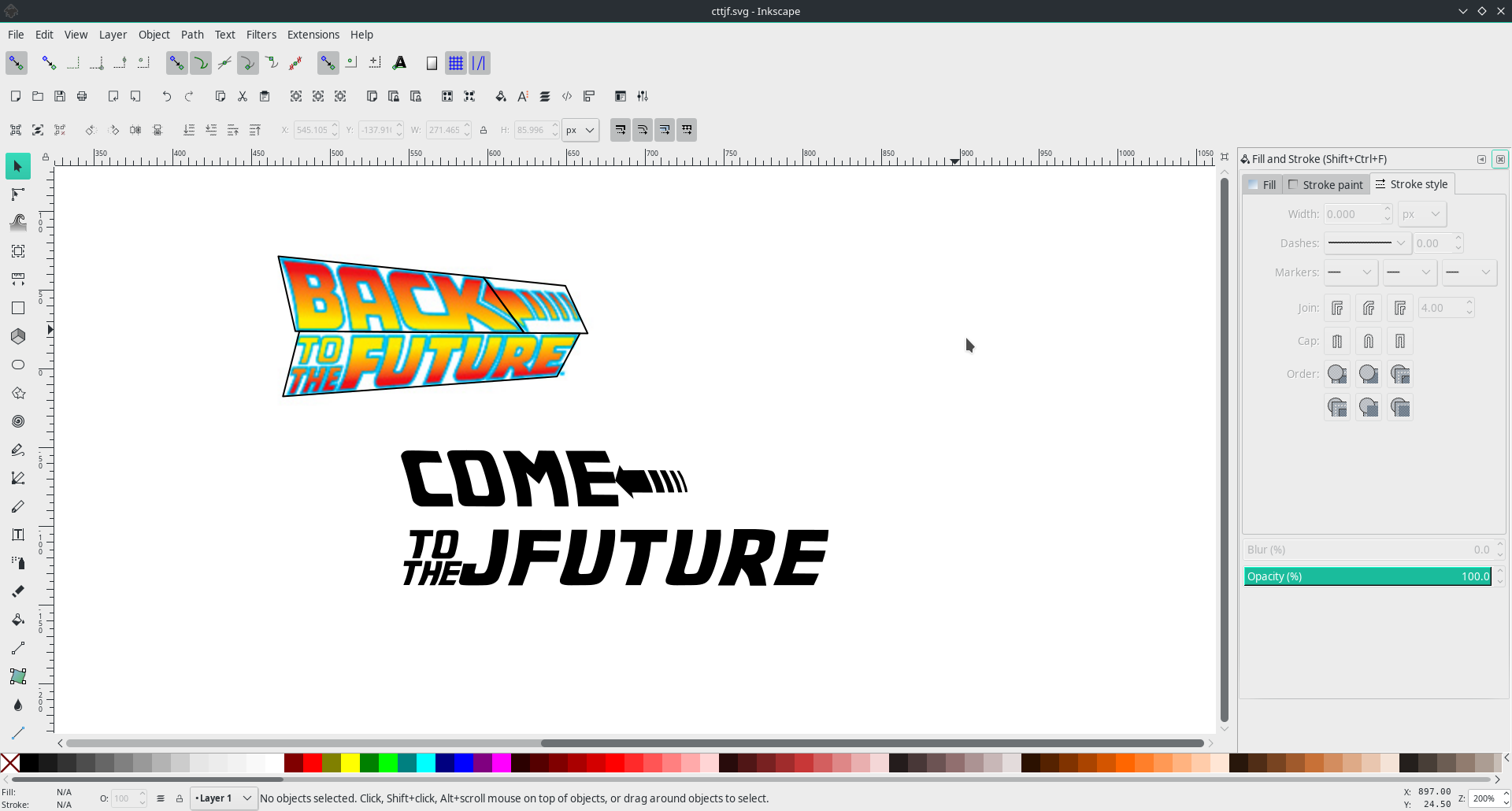
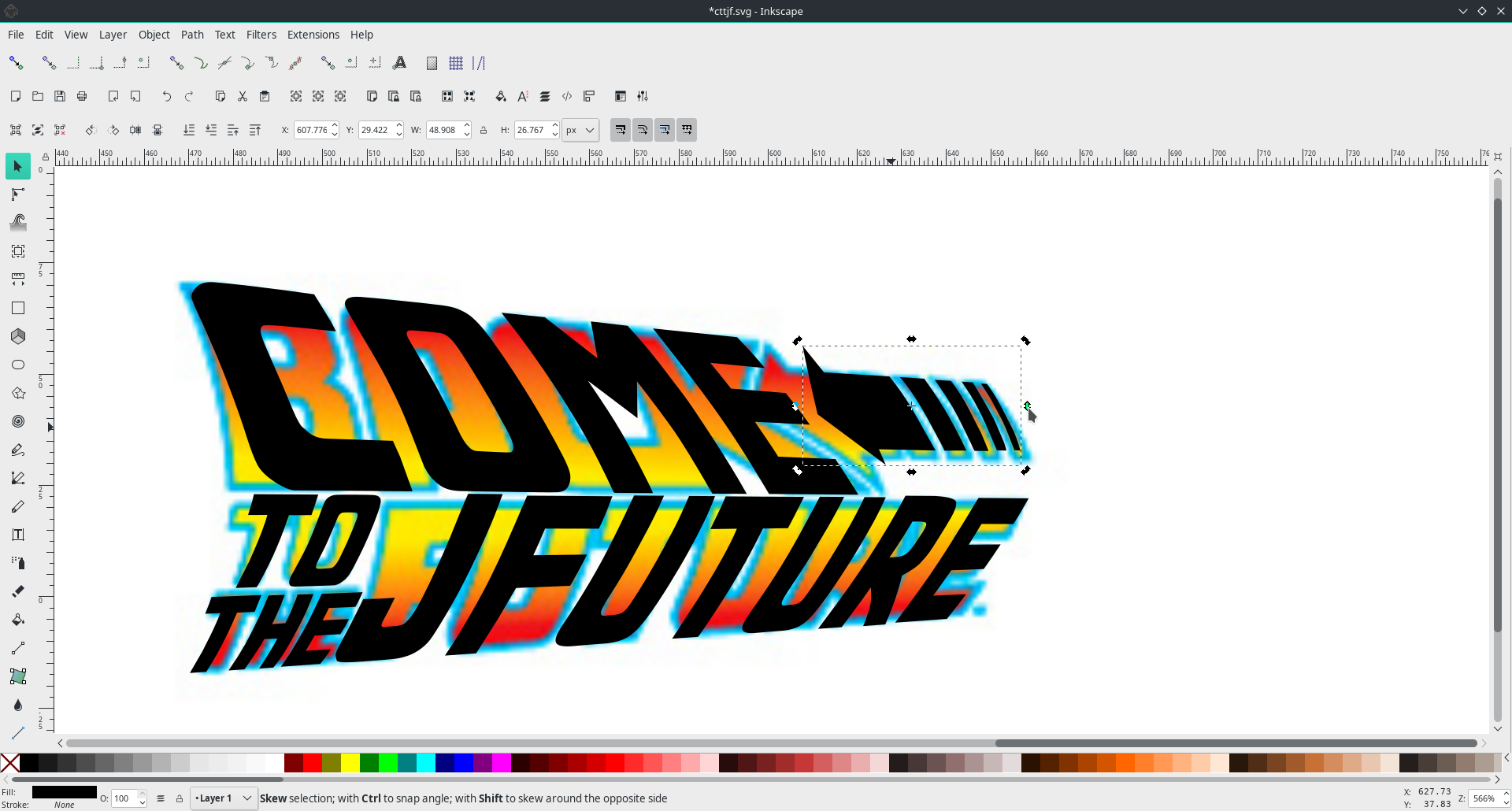
Select the arrow after “come” and tune it using small black arrows (pardon the pun) around the selection. You can tune “come” itself as well. However, don’t try to achieve pixel-perfect conformity, because done is better than perfect.
|
Tip
|
Click the selection to change between “scale” and “skew and rotate” modes. |
|
Tip
|
Done is better than perfect. |
Now will make the glow around the text.
Move the original picture so that it is not behind your design.
Zoom in to its edge and use “Pick colors from image” (F7) tool to select the glow color.
Hover the color you’re happy with and press Ctrl+C.
The color is copied into the clipboard.
Save it somewhere.
Let’s also select reddish color from the top of “come” and yellowish form its bottom.
I got this values:
-
Glow:
00b5e6ff -
Red:
fb0702ff -
Yellow:
fee900ff
Select “come” (it should be a group of four letter by this moment) and duplicate (“Object” → “Duplicate” or Ctrl+D) it.
Open “Fill and Stroke” menu by selecting “Object” → “Fill and Stroke…” or casting Ctrl+Shift+F.
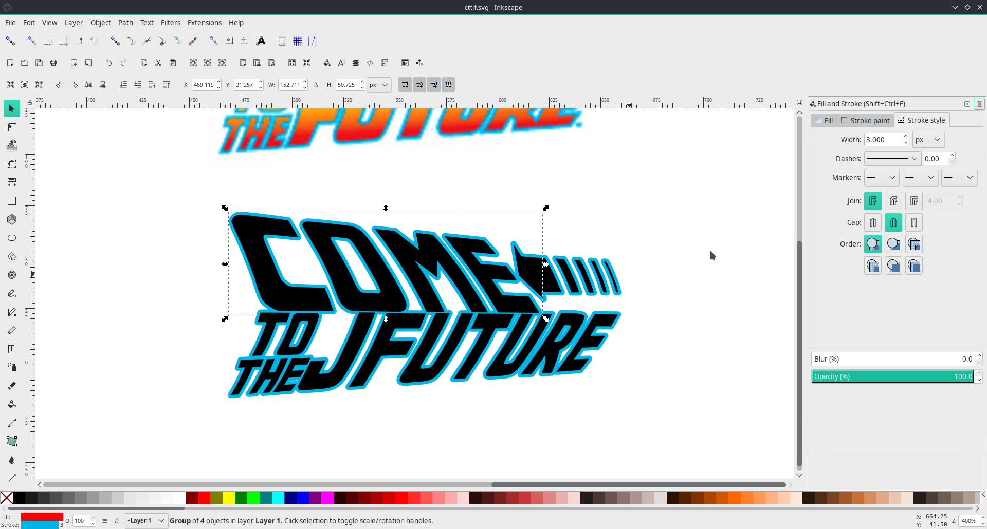
Use 00b5e6ff as a stroke and some red color as a fill for the duplicated object so that we can distinguish it from the original, now hidden below.
Repeat for the arrow and “to the future”.
If you see that stroke “eats” spacing between the parts of your text (letters or slashes in the arrow) — break that text apart (“Path” → “Break apart” or Ctrl+Shift+K) and move around to achive more spacing.
Stroke’s “Join” must be “Round join”, stroke’s “Cap” must be “Round cap”.
Strokes’s width depends on the object sizes, mine is 3px.
Yeah, I’m using pixels for vectors, shame on me!
|
Tip
|
Do not forget to duplicate object before stroking. |
After you’ve done, bring the original objects to the top by selecting them and clicking “Raise selection to top” (Home).
|
Tip
|
To select an object that is below another one hold Alt while clicking the mouse button.
|
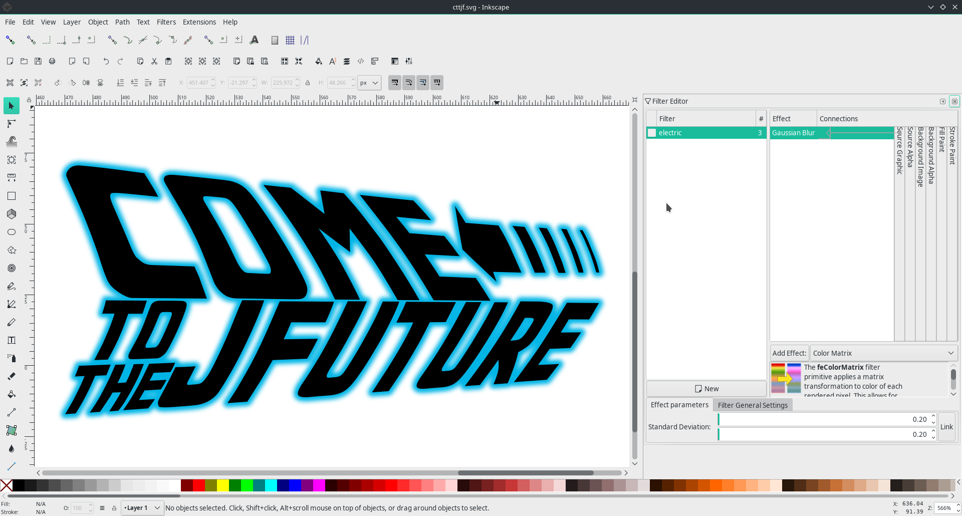
If you see this, you’re on the right path:
Now select the duplicates with strokes and cast a blur on them with “Filters” → “Blurs” → “Blur…”. Play with the parameters until it looks like you want, 0.2 worked for me:
We’re almost done, just need to add a gradient.
Select original (black) “come” and arrow, group (Ctrl+G) them together.
Call “Gradient” tool (G) and use fb0702ff and fee900ff as start and end.
Play with stop nodes until you’re happy.
Repeat for the bottom text line.
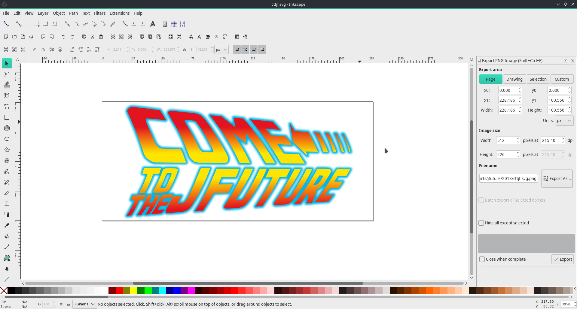
Polishing: increase spacing between top and bottom lines, re-group objects logically, resize page to drawing.
Final result:
Thanks for reading to the end!
P.S. Install JFuture’s Telegram sticker pack if you want to help us spread the information about the conference!